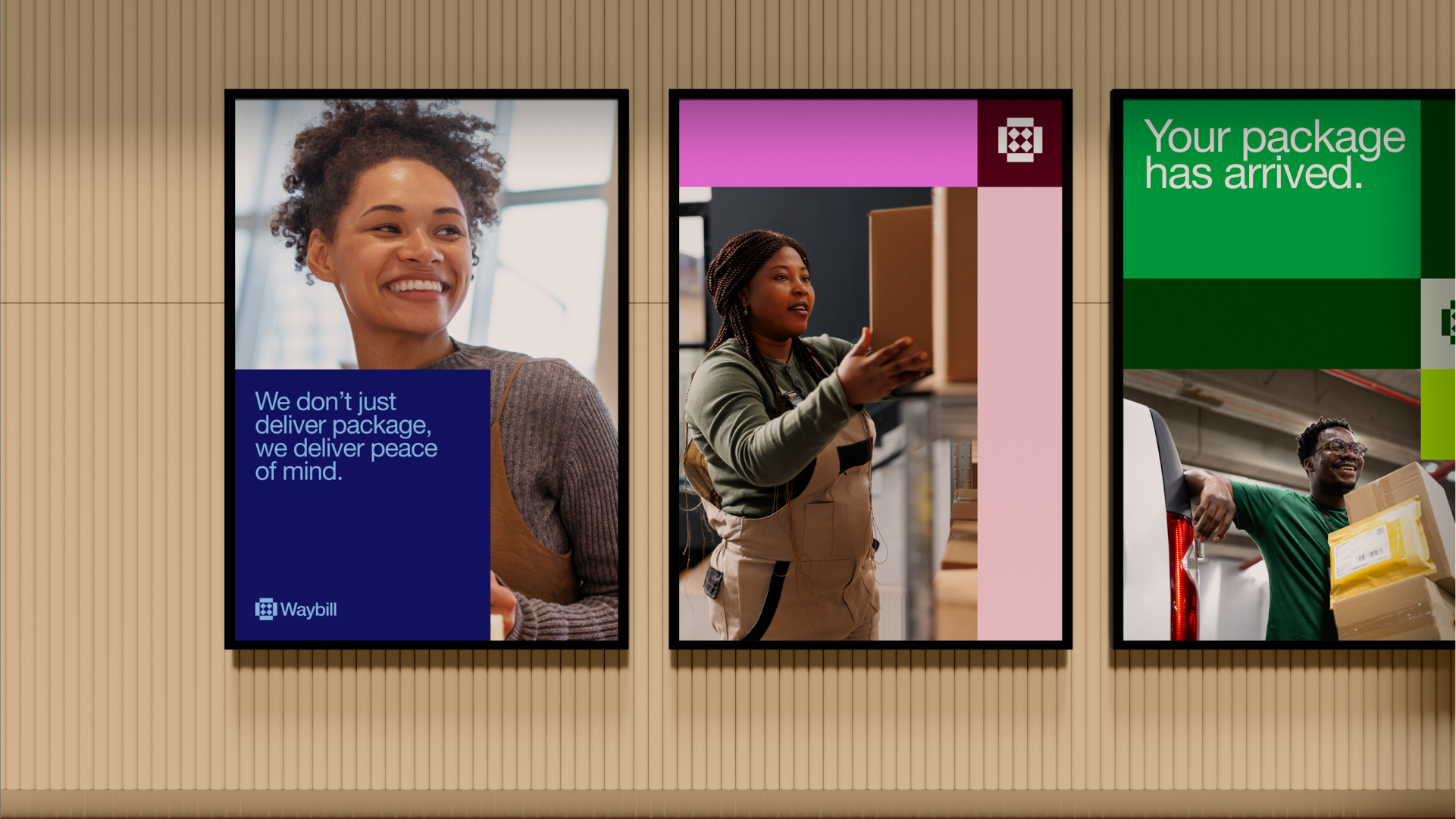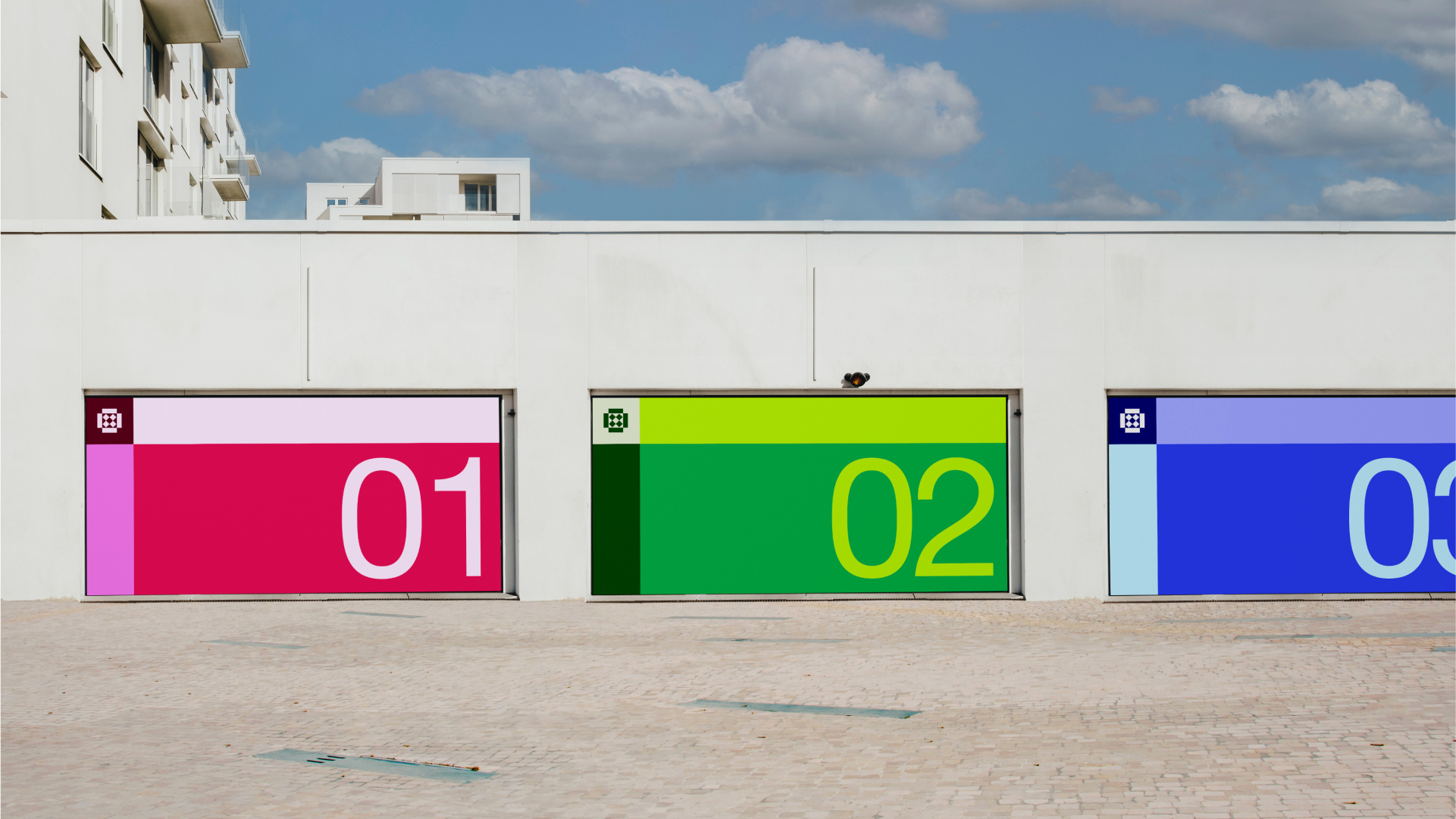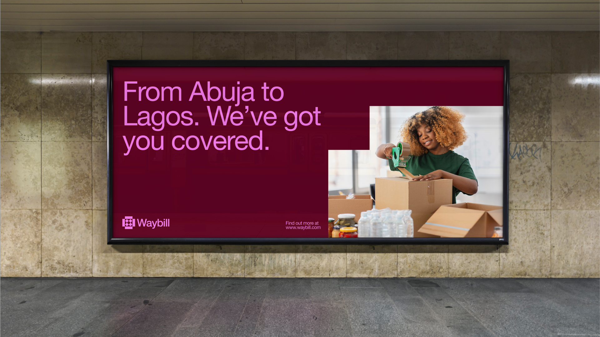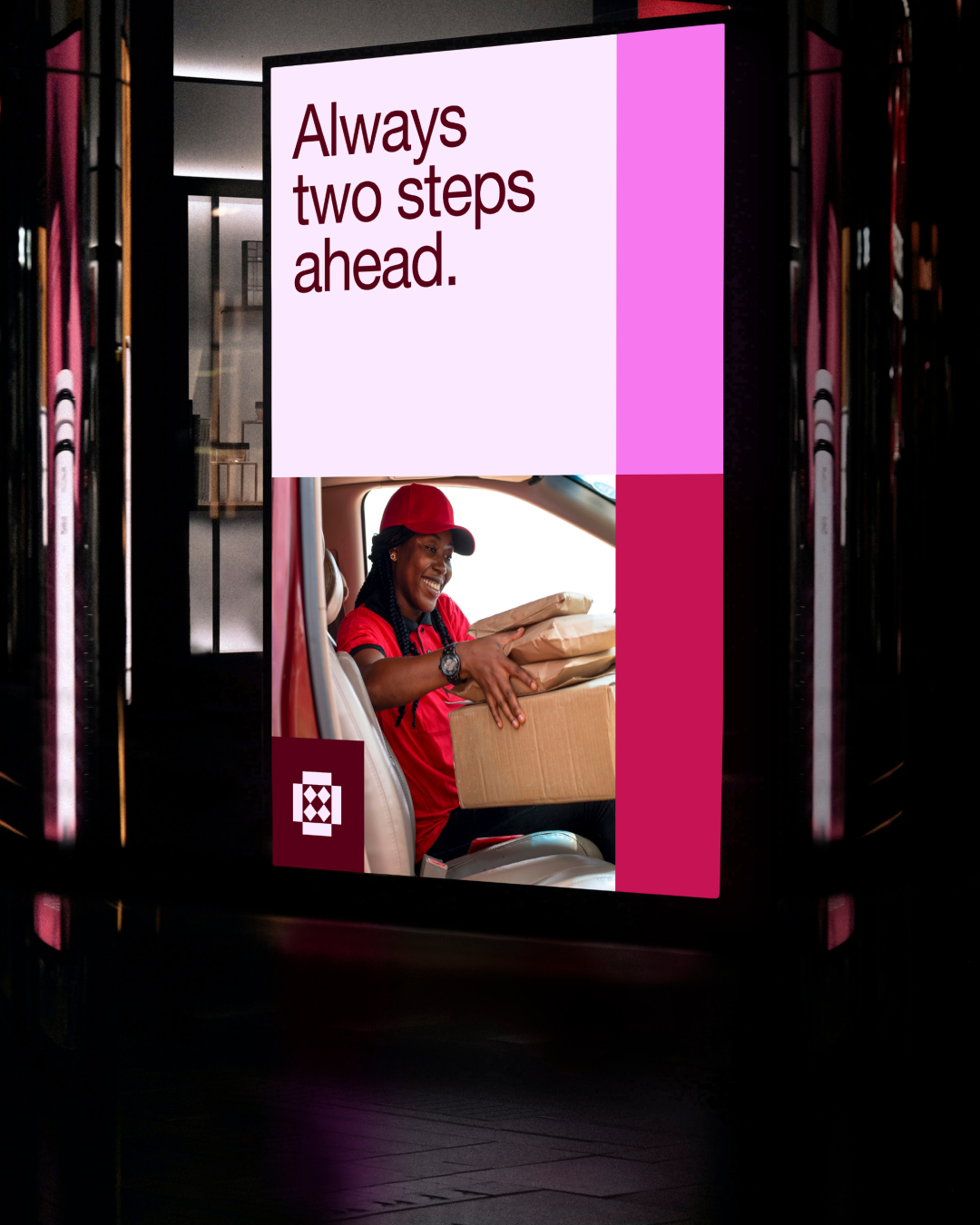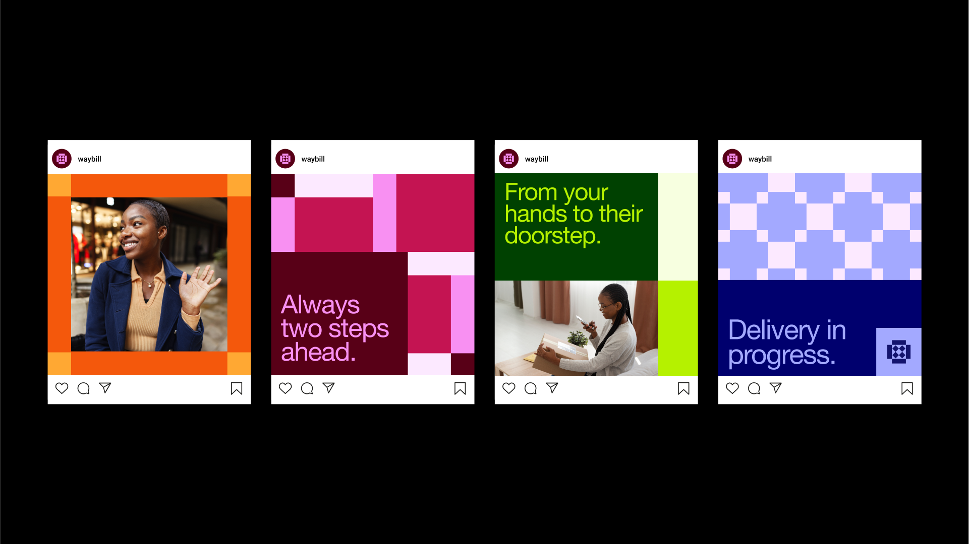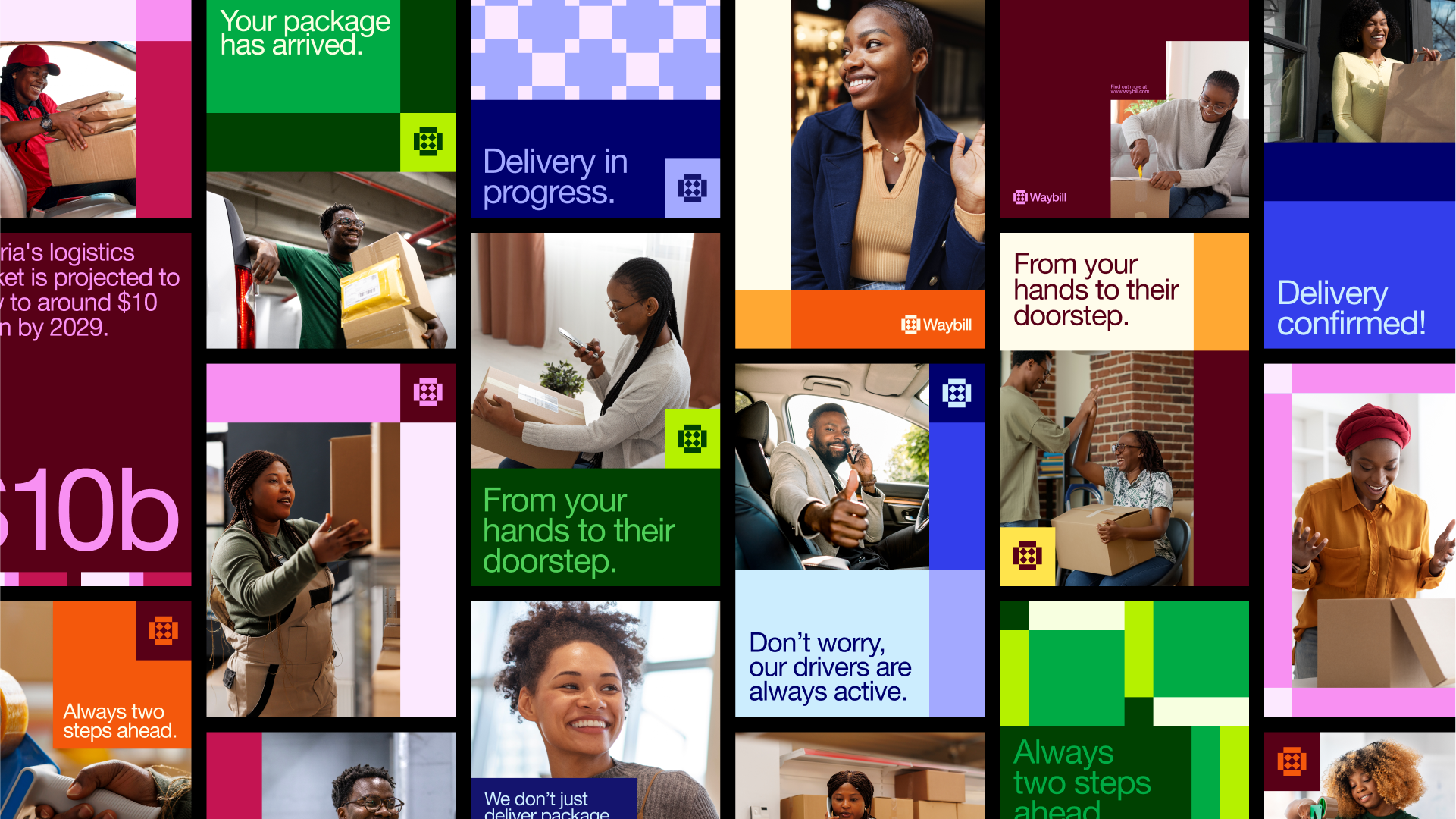
Waybill (a fictional brand) is a logistics and delivery company based in Nigeria, with ambitions to become a global leader in shipment services. With a vission to become a globally recognized logistics company offering innovative, reliable, and customer-centric delivery solutions. The company facilitates the seamless shipment of goods from one location to another, catering to both businesses and individual consumers.
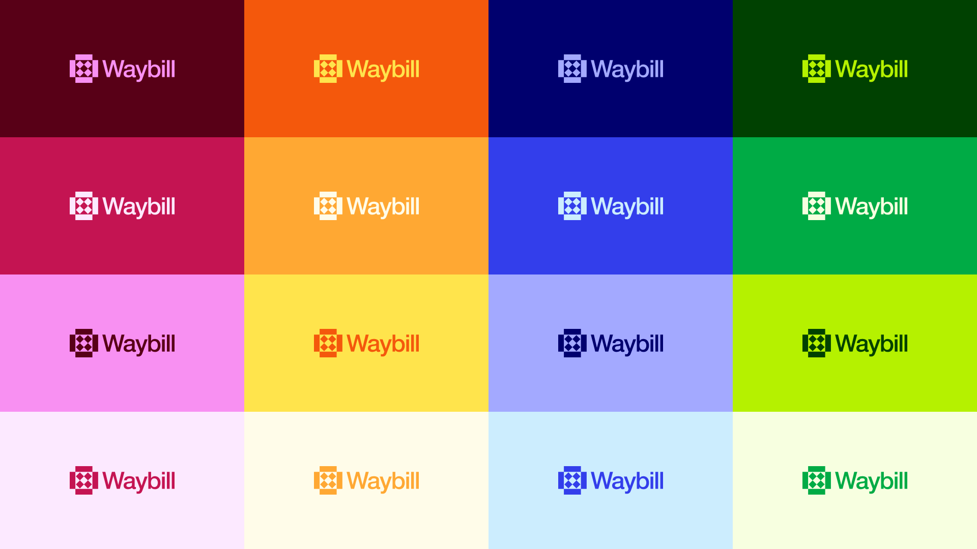
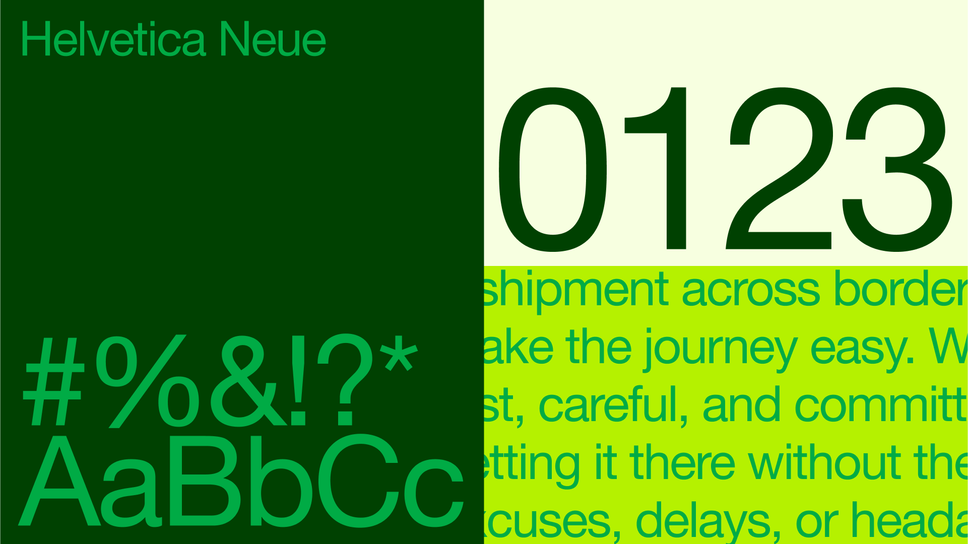
The Waybill logo combines clean typography with a strong geometric mark to create a balanced identity system. The wordmark uses a modern, sans-serif font that conveys professionalism, clarity, and forward-thinking energy. The color choice provides a unique and distinctive presence that sets Waybill apart from competitors in the logistics space.
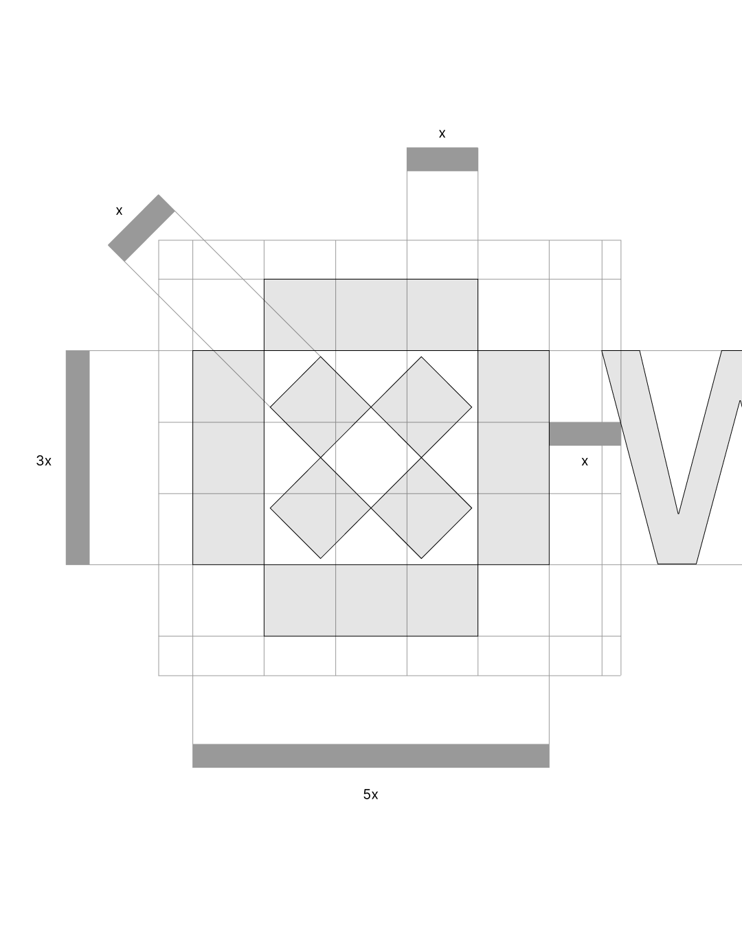
At the heart of the identity is the logo mark, which represents an open package.
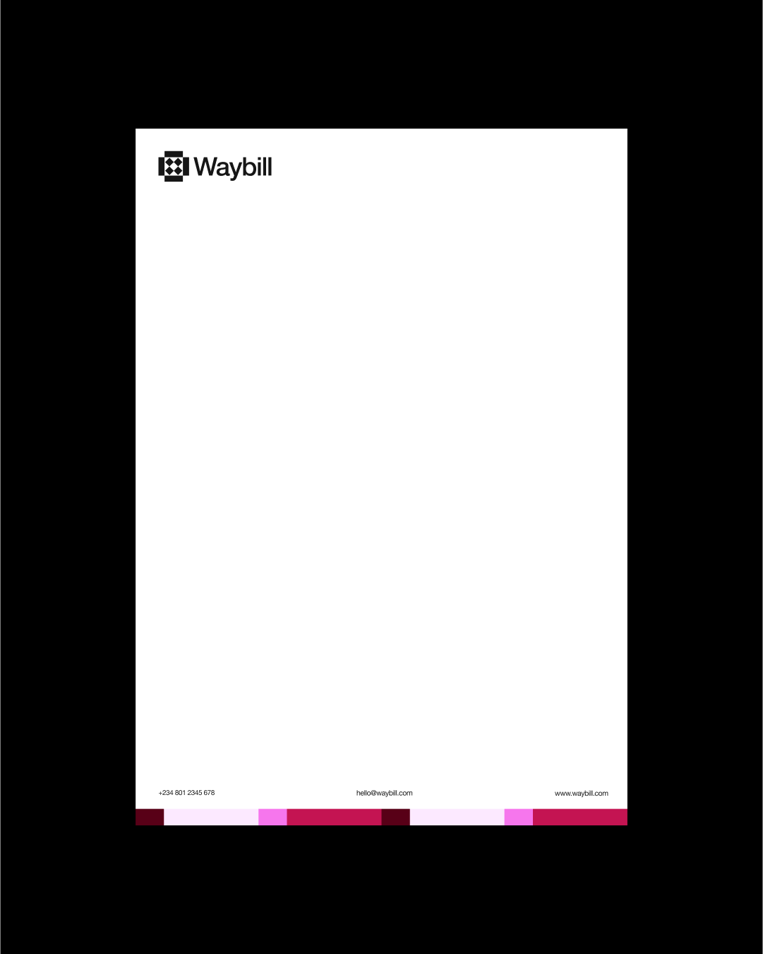
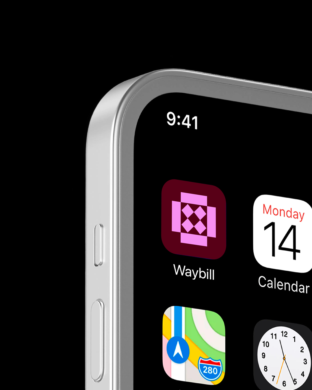
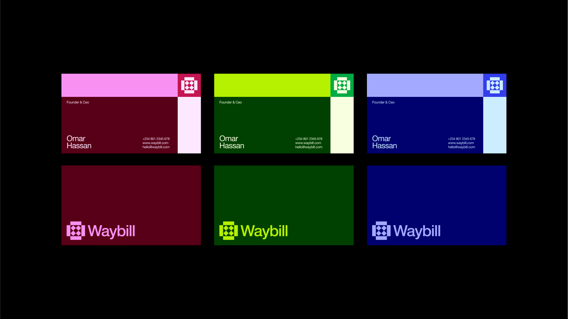
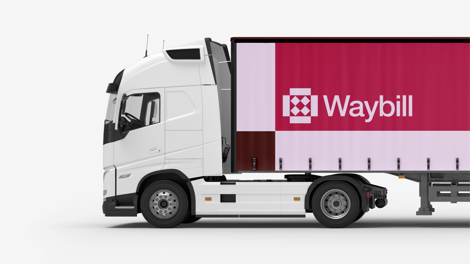
Beyond being a visual metaphor, the logo mark plays a huge role in the overall identity system. It is designed to be flexible, functioning seamlessly across a variety of applications—whether as a standalone icon, an app symbol, a pattern for brand collateral, or a visual anchor in digital and print communication. Its recognizability and adaptability ensure that the Waybill identity remains consistent and memorable across all touchpoints.


